Make your own virtual museum !
 What is a virtual museum ?
It is like a real museum except that it is nowhere and everywhere !
 It is also a natural improvement of the photo album that many collectors make to show their best items to other collectors. But it is above all a reflection about collecting in general. Instead of keeping a stock of things (often packed in cardboard boxes) only for yourself, why not display them for everyone in the world to see them ? Whether you collect postcards, or cameras or antique radios, you can make your own virtual museum and increase your chances to meet fellow collectors.
From the cardboard album to the electronic album, there is just a technical difference. But in both cases, pictures are the essential element. A virtual museum with poor pictures would have no interest at all. This is why I have started with hints and tips on photography.
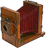
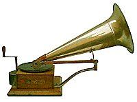
Making good photos of collectiblesAny modern digital camera will be fine. Most digital cameras now have a resolution of 10 Megapixels, which is much more than required for the web. Just avoid photophones unless you really have nothing else at hand !
The subject must always be in front of a white background which does not risk to interfere.
This background can be made with a large piece ( 1 metre x 2 metres is a minimum) of thin white hardboard which can be conveniently bent as shown here. A professional lighting with two reflectors will be the best to get a perfectly white light and avoid any shadows, but as such an equipment is rather expensive, you can use DIY solutions that will give good results for a cheaper investment...
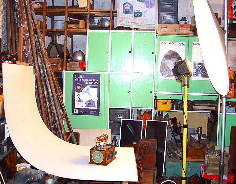 The same material used for the background can be used to make a large reflector. With a diameter of 1,20 m. you can get a very soft light without any shadows. Any kind of lamp of 500 watts will do as digital cameras can cope with any colour temperature. The camera must be mounted on a stable tripod because the reflector only reflects a fraction of the light source to the subject and "long time" exposure will often be necessary:
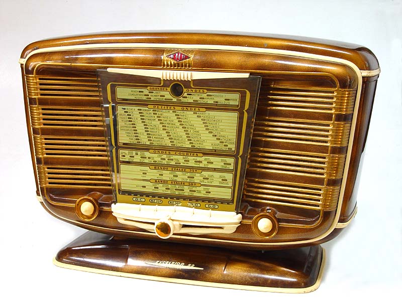
Finally, here is what you can get with this inexpensive set up and a little practice...
 Picture size
Picture size is no longer a problem in 2009, as most people now have wide screens and ADSL access to the internet. Large pictures on your web pages will be more attractive for viewers. Dont hesitate to post pictures as big as 1024 x 768 pixels. Big is beautiful !
Text and page setting Now you need text to go with the pictures, but only what is necessary. No blah blah, no digressions. The text only has to explain and justify the picture. A Web page does not allow easy reading of long texts. It will never beat a good old paper book ! Therefore, be brief and precise and above all do not leave any mistakes. HTML editors can check the spelling, so have no excuse for leaving mistakes. HTML language does not allow a very precise page set up, but just do your best and try to keep a good balance between text and pictures. Do not use too many different fonts and colours. Using a dark font on a clear background will improve readability and your readers will be thankful for that...
Unity of styleA museum is not a flea market. You must give an impression of unity and order. If you use a page background, the same one must be used for all pages. It must be very light and clear so that it does not interfere with readability of the text. Avoid backgrounds with large repetitive graphics even if they are related to the subject . This adds nothing to the beauty of the scene and tends to bore the customer !
Those were the humble cogitations that came to my mind while making those web pages. I am in no way an HTML specialist but I hope that future Virtual Museum designers will find some interest there.